Contact Us


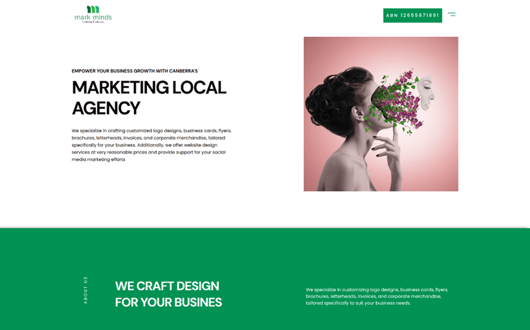
QRemember
Key Insights and Design Strategies Driving QRemember’s Website Creation
Our Role
At Ikran Innovation, we designed, developed, and optimized QRemember’s website using a WPBakery theme. Our focus was on creating an intuitive, engaging, and emotionally meaningful digital memorial platform, improving user experience, enhancing discoverability of features, implementing SEO best practices, and running Google Ads campaigns to increase awareness and conversions.
Team Structure
- 2 UX Designers/Developers, 1 SEO SpecialistResearch Methods
- Competitor analysis, User Surveys, Usability Testing, Keyword ResearchDiscipline
- UX Design, UI Design, Web Development, SEO, Paid MarketingPlatform
- Web and mobileTime Frame
- 3 monthsTechnology we used


Overview
QRemember, a digital memorial platform, experienced low user registrations, limited engagement, and minimal online visibility due to complex feature navigation, insufficient trust signals, and unoptimized SEO/paid marketing. They partnered with Ikran Innovation to create, develop, and optimize the website within a WPBakery theme for a more intuitive, engaging, and discoverable online presence.Outcomes
Improved feature discoverability and readability across all memorial and platform sections
Enhanced responsive design for seamless mobile and web experience
Strategic Value
Our design, development, SEO, and Google Ads strategy emphasized emotional storytelling, intuitive navigation, trust-building elements, and organic + paid visibility to drive engagement, registrations, and long-term growth.
Outcomes
80%
Increase in user registrations within 3 months
65%
Increase in memorial page contributions
95%
Positive client feedback on usability and emotional experience
“The new QRemember website makes it easy for families to preserve memories while feeling secure and emotionally connected. Ikran Innovation delivered a platform that’s both intuitive and meaningful.”
Jane Doe
Founder & CEO
The Challenge
During our evaluation of the QRemember platform, we identified several issues that were creating friction in the user journey. These gaps made it harder for visitors to understand the platform’s features, trust the service, and move confidently toward creating memorials or sharing memories.
Complex Feature Navigation: Users struggled to find and use the platform’s memorial creation and sharing features efficiently, leading to frustration and drop-offs.
Limited Emotional Engagement: The site lacked storytelling, guiding content, and trust-building elements that connect users emotionally with the platform.
Low Visibility and Discoverability: The absence of SEO optimization and clear content hierarchy reduced discoverability of key platform features, limiting registrations and engagement.
Note: The three primary issues identified were complex feature navigation, limited emotional engagement, and low visibility, each contributing to lower user registrations and engagement.
To ensure the new website addressed these challenges effectively, we conducted comprehensive research, including user surveys, interviews, usability testing, and competitor analysis. This research provided actionable insights that guided our design, development, SEO, and Google Ads strategy for the QRemember website.
Research
To uncover the key factors behind low user registrations and engagement, and to identify where users were encountering friction, we conducted:
Outcomes
Surveys with 40 QRemember users and new visitors to assess website clarity, usability, and emotional engagement
Interviews with 7 repeat users to uncover pain points, feature preferences, and content expectations
Competitive analysis of leading memorial and digital legacy platforms to gather insights on layout, storytelling, and trust-building strategies
Strategic Value
This research enabled us to design and develop a website that highlights the emotional and functional value of QRemember, simplifies memorial creation, and encourages ongoing user engagement.
Outcomes
Improved User Understanding: Identified key pain points and content gaps, enabling clearer presentation of platform features and guidance on memorial creation
Enhanced User Experience: Discovered navigation friction points and feature usability issues, guiding a more intuitive and seamless user journey
Optimized SEO & Visibility: Highlighted high-value keywords and competitor best practices, informing content optimization and Google Ads strategy to increase organic traffic and registrations

This research provided us with actionable insights into user behavior, content clarity, and competitive positioning. Leveraging these findings, we were able to design, develop, and optimize the QRemember website to enhance usability, drive registrations, and improve search visibility.
Insights Recommendation
Insight 1
During usability testing, we observed that first-time users struggled to understand how to create and manage digital memorials. Many were unclear on the steps required to register, set up profiles, and share memories, causing hesitation and drop-offs.
Web
Mobile

Surveys indicated that 72% of new users felt overwhelmed by the amount of information presented on the homepage, which reduced their confidence in using the platform effectively.
Web
Mobile
Unclear information on features like '50 broadcasts per month' and '30k messages per month' further added to the confusion. This ambiguity led to an impression of incompleteness, impacting user trust and decision-making.
Web
Mobile
Competitive analysis showed that top memorial platforms use a clear step-by-step process, visual cues, and reassurance messages to guide new users, which QRemember lacked.
Users struggled to navigate the registration and memorial creation process efficiently
Lack of clear guidance and visual hierarchy caused confusion and frustration
Concerns over privacy and security reduced trust and willingness to engage
This insight demonstrated that unclear onboarding and insufficient guidance were major barriers to user adoption and engagement. Addressing these gaps became a priority in the website development process to ensure new users could quickly understand, trust, and start using the platform confidently.
Recommendation 1
Simplify and streamline the onboarding and memorial creation process on QRemember to ensure new users can easily understand how to create, manage, and share digital memories. Clear guidance, visual cues, and reassurance messages will help build trust and improve overall engagement.
Web
Mobile
Introduce a step-by-step guided setup for new users to create their first memorial effortlessly.

Add clear visual cues and progress indicators to show users where they are in the setup process.
Simplify homepage content with concise messaging to reduce information overload.
Include tooltips, hover explanations, and contextual guidance to assist users in understanding features.

Highlight privacy and security measures prominently to reassure users about sharing memories.
Incorporate micro-interactions and feedback messages to confirm actions and encourage continued use.
Outcome
Enhanced user understanding, increased trust, and improved adoption rates, resulting in a more intuitive and engaging onboarding experience for first-time users.
Insight 2
User testing revealed that visitors struggled to emotionally connect with the platform due to impersonal and overly technical language. Users wanted a more inviting and engaging tone that reflected the personal and sentimental nature of creating and sharing memories.
95% of surveyed users preferred content that felt warm, human, and approachable, allowing them to feel comfortable while sharing personal stories. The lack of friendly messaging made some users hesitant to interact deeply with the platform.
Rewrite key copy with conversational and empathetic language to convey warmth and care.
Use storytelling elements to demonstrate how memories can be preserved and shared meaningfully.
Incorporate visual cues such as icons and imagery to make content feel more relatable and engaging.
By adopting a friendlier, more emotionally resonant tone, QRemember can strengthen user engagement, encourage interactions, and make the platform feel more personal and trustworthy, ultimately improving retention and activity rates.
Recommendation 2
Adopt a warmer, more approachable tone across the website to emotionally connect with users and make them feel comfortable sharing and preserving memories.
Web
Mobile
Rewrite key website copy and CTAs using conversational, empathetic language that aligns with the sentimental nature of the platform.
Outcome
Increased user engagement and comfort, fostering stronger emotional connections with the platform and encouraging users to actively create and share memories.
Insight 3
The website lacked clear trust-building elements, making new users hesitant to register or store personal memories. Without visible reassurances, visitors were uncertain about data security, privacy, and platform reliability.
Users also indicated that the absence of testimonials or success stories reduced confidence in the platform’s value. They wanted to see real-life examples of how QRemember helped preserve meaningful memories.
Lack of visible security and privacy assurances caused hesitation in account creation.
Absence of testimonials and user stories reduced perceived credibility.
Limited social proof weakened the overall trust and engagement with the platform.
This insight highlighted the importance of incorporating trust signals and success stories throughout the platform to reassure users about security, privacy, and the meaningful value of engaging with QRemember.
Recommendation 3
Introduce trust-building elements and visible social proof throughout the QRemember platform to reassure new users, enhance credibility, and encourage registrations and active engagement.
Web
Mobile
Display user testimonials, success stories, and featured memories to showcase real-life benefits and the emotional value of using QRemember.
Highlight data privacy, security measures, and platform reliability to instill confidence in first-time users.
By integrating these trust signals across key pages, including the homepage, onboarding flows, and account dashboards, users feel more secure and confident engaging with the platform. This reduces hesitation and fosters long-term engagement.
Outcome
Increased user trust, higher account registrations, and improved engagement metrics through a more credible, transparent, and emotionally reassuring user experience.
Insight 4
User testing revealed that the platform’s interface lacked visual consistency and clarity, making it difficult for users to navigate between saving, recalling, and sharing memories efficiently.
Some users reported confusion with interactive elements, such as buttons, notifications, and memory categories, which affected overall engagement and task completion.
Inconsistent visual hierarchy and design elements led to difficulty in scanning and locating key features.
Non-intuitive placement of actions like “Add Memory” or “Share Memory” caused hesitation and slower adoption.
Lack of contextual cues for memory types and categories reduced clarity and user confidence.
These findings highlighted the need for a more cohesive, intuitive, and visually guided interface to enhance user navigation, improve feature discoverability, and create a seamless memory management experience on QRemember.
Recommendation 4
Enhance the visual consistency and interface clarity across the QRemember platform to improve navigation, feature discoverability, and overall user confidence. A cohesive design and intuitive layout will make memory-saving and sharing more seamless.
Web
Mobile
Standardize design elements such as buttons, icons, colors, and typography to create a unified and professional look.
Reorganize key actions and interactive elements, placing “Add Memory,” “View Memory,” and “Share Memory” in prominent, predictable locations to reduce user confusion.
Implementing these improvements ensures users can navigate effortlessly, understand the purpose of each feature at a glance, and feel confident engaging with the platform regularly.
Outcome
Increased user engagement, reduced navigation errors, and improved overall platform satisfaction through a visually consistent and intuitive interface.
Insight 5
The platform’s search and filtering functionality was limited, making it difficult for users to quickly find specific memories or categories. Users often spent excessive time scrolling through lists, which impacted engagement.
Users expressed frustration with unclear labeling and a lack of predictive suggestions, which reduced confidence in finding the right content efficiently. The absence of intuitive sorting and filtering options also contributed to lower task completion rates.
Limited filter and search options caused users to miss relevant memories.
Inconsistent labeling and unclear category organization increased cognitive load.
Lack of predictive search and auto-complete features slowed down content discovery.
These insights highlighted the need to implement advanced search and filtering mechanisms, along with clearer categorization and predictive suggestions, to make content discovery faster, more accurate, and more satisfying for users.
Recommendation 5
Enhance the platform’s search and filtering functionality to enable users to quickly locate specific memories, categories, or content types. Streamline navigation and provide predictive suggestions to improve efficiency and satisfaction.
Web
Mobile
Implement advanced filtering options based on category, date, tags, and popularity to allow users to narrow down search results efficiently.
Add predictive search, auto-complete, and clear category labeling to reduce browsing time and guide users to relevant content.
By optimizing search and filtering, users can quickly find desired memories or content, spend less time navigating, and have a more confident and satisfying experience on the platform.
Outcome
Improved content discoverability, reduced user frustration, and increased engagement and retention through more intuitive and efficient search and navigation features.
Looking for expert guidance?