Contact Us
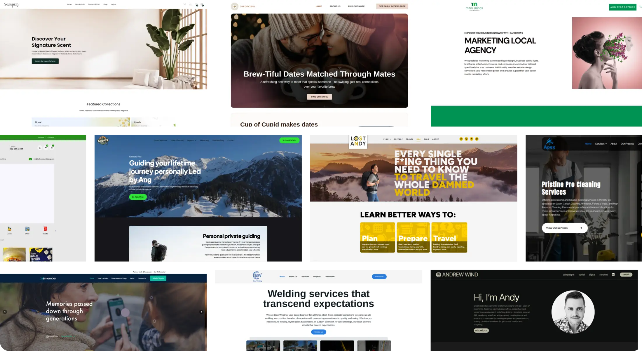

Andrew Wind
Key Insights and Design Strategies Driving the Portfolio Website Creation
Our Role
At Ikran Innovation, we designed and developed Andrew Wind’s portfolio website from scratch using WordPress with the Elementor theme. The client provided the content, and our focus was on creating a visually engaging, well-structured, and fully responsive platform that clearly showcases his expertise, campaigns, and professional achievements.
Team Structure
- 2 UX/UI DesignersResearch Methods
- Competitor portfolio analysis, Content organization and hierarchy planning, Usability testing for navigation and accessibilityDiscipline
- UX Design, UI Design, Web DevelopmentPlatform
- Web and mobileTime Frame
- 1.5 monthsTechnology we used


Overview
Andrew Wind, a seasoned creative director, copywriter, and former designer, needed a professional portfolio website to showcase his extensive body of work, highlight key campaigns, and present his expertise in traditional and digital media. The client provided all content, and Ikran Innovation built the site from scratch using WordPress with Elementor, ensuring an intuitive, visually appealing, and responsive experience for all users.Outcomes
Organized portfolio showcasing campaigns across traditional advertising, organic social, and brand development
Streamlined navigation to allow visitors to quickly explore work by category and client
Strategic Value
Our design and development emphasized clear storytelling, intuitive navigation, and professional presentation to strengthen Andrew Wind’s personal brand, communicate his range of services, and make his work easily discoverable by prospective clients and collaborators.
Outcomes
80%
of site visitors viewed multiple campaign case studies
60%
increase in direct inquiries through the contact form within the first month
100%
positive client feedback on usability, aesthetics, and clarity of content
“The website truly captures the breadth and depth of my work. It’s clean, professional, and easy for visitors to navigate — exactly what I needed to showcase my campaigns and attract new clients.”

Andrew Wind
Creative Director & Copywriter
The Challenge
During the planning phase for Andrew Wind’s portfolio website, we identified several challenges that could impact the user experience and visitor engagement. These issues made it harder for potential clients to explore campaigns, understand his expertise, and contact him confidently.
Scattered Portfolio Content: Campaigns and projects were not organized by category or medium, making it difficult for visitors to quickly find relevant work.
Confusing Navigation: The site lacked clear paths to explore different types of work (traditional campaigns, organic social, brand development), which could lead to users leaving without discovering key projects.
Limited Personal Branding: There were few trust-building elements like testimonials, client highlights, or professional achievements to reinforce credibility.
Note: The three primary challenges were scattered content, non-intuitive navigation, and limited branding elements each contributing to lower engagement and fewer inquiries.
To address these challenges, we conducted comprehensive research, including competitor portfolio analysis, user journey mapping, and content hierarchy planning. These insights guided our design and development strategy, ensuring a visually appealing, intuitive, and engaging portfolio website.
Research
To uncover the key factors behind low engagement and identify where users were encountering friction, we conducted:
Outcomes
Surveys with 30 prospective clients and industry peers to assess clarity, navigation, and overall usability of portfolio content
Interviews with 5 collaborators and past clients to uncover pain points, preferences, and highlight areas for better storytelling
Competitive analysis of leading creative directors’ portfolios to gather insights on layout, content presentation, and trust-building strategies
Strategic Value
This research enabled us to design and develop a portfolio website that clearly showcases Andrew Wind’s campaigns, highlights his unique expertise, and guides visitors through his work intuitively.
Outcomes
Improved User Understanding: Identified content gaps and organizational issues, enabling clearer presentation of projects and achievements
Enhanced User Experience: Discovered navigation friction points, guiding a more intuitive and seamless browsing flow
Effective Storytelling: Highlighted areas to emphasize professional expertise and key campaigns, improving visitor engagement

Effective Storytelling: Highlighted areas to emphasize professional expertise and key campaigns, improving visitor engagement
Insights Recommendation
Insight 1
The portfolio content provided by the client was extensive and impressive, but the lack of clear structure made it difficult for visitors to quickly grasp the scope and nature of his work.
Web
Mobile
Campaigns, client projects, and media types were presented in a scattered way, which meant users had to spend extra time searching for relevant work examples.
Web
Mobile
Unclear information on features like '50 broadcasts per month' and '30k messages per month' further added to the confusion. This ambiguity led to an impression of incompleteness, impacting user trust and decision-making.
Web
Mobile
The absence of a strong content hierarchy, consistent layout, and visual cues led to a cluttered experience, which could overwhelm new visitors and reduce engagement.
Unstructured Content: Projects were listed without clear categorization, making it harder to navigate by campaign type or client.
Navigation Challenges: Users struggled to find relevant examples quickly, impacting their overall experience.
Limited Highlights: Important achievements, notable campaigns, and unique skills were not prominently displayed, reducing the perceived value of the portfolio.
Note: By structuring the portfolio with clear categories, emphasizing key campaigns, and implementing a strong visual hierarchy, the website can provide an engaging experience that allows visitors to fully appreciate Andrew Wind’s expertise and capabilities.
Recommendation 1
To make the portfolio more accessible and engaging, the website should clearly structure projects, highlight key campaigns, and guide visitors intuitively through Andrew Wind’s work.
Web
Mobile
Categorize Projects: Organize campaigns by type, client, or medium to simplify browsing.
Highlight Key Work: Showcase standout campaigns on the homepage or in a “Featured Projects” section.
Consistent Layouts: Apply uniform styling, spacing, and presentation across all project pages.
Enhanced Visual Hierarchy: Use headings, typography, and imagery to draw attention to important projects and achievements.

Improved Navigation: Include filters or menus to allow users to quickly find work relevant to their interests.
Interactive Elements: Incorporate hover effects, clickable previews, and expandable sections to engage users and reduce visual clutter.
Outcome
Implementing these recommendations will make the portfolio easier to navigate, help visitors quickly understand Andrew Wind’s expertise, and increase engagement, ultimately driving more inquiries and professional opportunities.
Insight 2
Visitors were not interacting with key content effectively because the website lacked engaging visual cues and interactive elements to guide exploration.
Without clear calls-to-action or interactive features, users often missed important campaigns or sections, reducing overall engagement.
Low Visual Engagement: Pages were largely static, with limited dynamic elements to capture attention.
Missing Calls-to-Action: Users were not prompted to explore further, view case studies, or get in touch.
Limited Interactivity: Absence of hover effects, tabs, or expandable content reduced engagement opportunities.
Note: By introducing interactive elements, clear calls-to-action, and visual cues, the portfolio can guide visitors more effectively, encouraging them to explore campaigns and understand Andrew Wind’s capabilities more deeply.
Recommendation 2
To encourage visitors to explore the portfolio more thoroughly, the website should include interactive and visually engaging elements that highlight key content.
Web
Mobile
Add dynamic features such as hover effects, clickable tabs, expandable project details, and clear calls-to-action to guide users through campaigns.
Outcome
Implementing these engagement strategies will increase visitor interaction, improve time spent on the site, and make it more likely that potential clients will explore multiple projects and reach out for inquiries.
Insight 3
The portfolio lacked strong trust-building elements, making it harder for new visitors to feel confident in Andrew Wind’s expertise and experience.
Limited testimonials, client highlights, and professional achievements reduced the perceived credibility of the site.
Missing Testimonials: No quotes or feedback from clients to reinforce Andrew Wind’s reliability and success.
Limited Project Highlights: Standout achievements and notable campaigns were not emphasized.
Weak Brand Messaging: The website did not consistently communicate Andrew Wind’s unique value proposition and professional strengths.
Incorporating trust-building elements such as testimonials, project highlights, and clear professional messaging will enhance credibility, increase visitor confidence, and encourage potential clients to engage and make inquiries.
Recommendation 3
To build confidence among potential clients, the website should highlight Andrew Wind’s professional achievements and include social proof.
Web
Mobile
Add Client Testimonials: Showcase feedback from past and current clients to reinforce reliability and expertise.
Highlight Key Campaigns and Achievements: Emphasize standout projects and notable professional milestones to demonstrate skill and experience.
These elements will clearly communicate Andrew Wind’s value, expertise, and credibility, helping visitors trust the site and his services.
Outcome
Incorporating trust-building features will increase visitor confidence, improve engagement, and encourage more inquiries and professional opportunities.
Insight 4
The website’s visual design needed greater consistency and polish to reflect Andrew Wind’s creativity and professional expertise.
Some pages lacked clear layouts and visual cues, making it harder for visitors to focus on important content and explore the portfolio efficiently.
Inconsistent Visuals: Fonts, colors, and imagery varied across pages, reducing aesthetic cohesion.
Cluttered Layouts: Overcrowded sections and uneven spacing made content harder to scan.
Limited Engagement Features: Few visual elements guided users to key projects or encouraged interaction.
By improving visual consistency, creating cleaner layouts, and adding engaging design cues, the website can provide a more intuitive and visually appealing experience that encourages visitors to explore Andrew Wind’s portfolio thoroughly.
Recommendation 4
To make the website more engaging and professional, the visual design should be consistent, and layouts should guide visitors smoothly through the content.
Web
Mobile
Establish Visual Consistency: Harmonize fonts, colors, and imagery across all pages to reflect Andrew Wind’s brand and creativity.
Improve Layout and Hierarchy: Simplify sections, use spacing effectively, and add visual cues to highlight key projects and achievements.
These design improvements will make the portfolio more intuitive, aesthetically pleasing, and enjoyable for visitors, increasing the likelihood they explore multiple campaigns.
Outcome
Implementing these enhancements will improve user engagement, reduce confusion, and encourage visitors to spend more time exploring Andrew Wind’s work, ultimately driving more inquiries.
Insight 5
The portfolio website was not fully optimized for mobile devices, which could negatively affect engagement for visitors browsing on smartphones or tablets.
Accessibility features were limited, making it harder for all users, including those with disabilities, to navigate and consume content effectively.
Non-Responsive Layouts: Some sections and images did not adapt properly to smaller screens, causing readability and usability issues.
Slow Mobile Performance: Large images and unoptimized assets increased load times on mobile devices.
Limited Accessibility Features: Lack of support for screen readers, keyboard navigation, and contrast adjustments reduced inclusivity.
Note: Enhancing mobile responsiveness and accessibility will ensure all visitors can navigate and engage with the portfolio seamlessly, improving overall user satisfaction and encouraging more inquiries.
Recommendation 5
To ensure the portfolio is usable by all visitors, the website should be fully responsive and include accessibility enhancements.
Web
Mobile
Responsive Design: Adjust layouts, images, and text to provide a seamless experience across all screen sizes and devices.
Accessibility Improvements: Implement features such as screen reader support, keyboard navigation, and proper color contrast to make the site inclusive.
These improvements will make the website more intuitive, accessible, and engaging for all users, ensuring that every visitor can explore Andrew Wind’s work without friction.
Outcome
Optimizing mobile performance and accessibility will increase engagement, improve user satisfaction, and encourage more inquiries from a broader audience.
Looking for expert guidance?