Contact Us
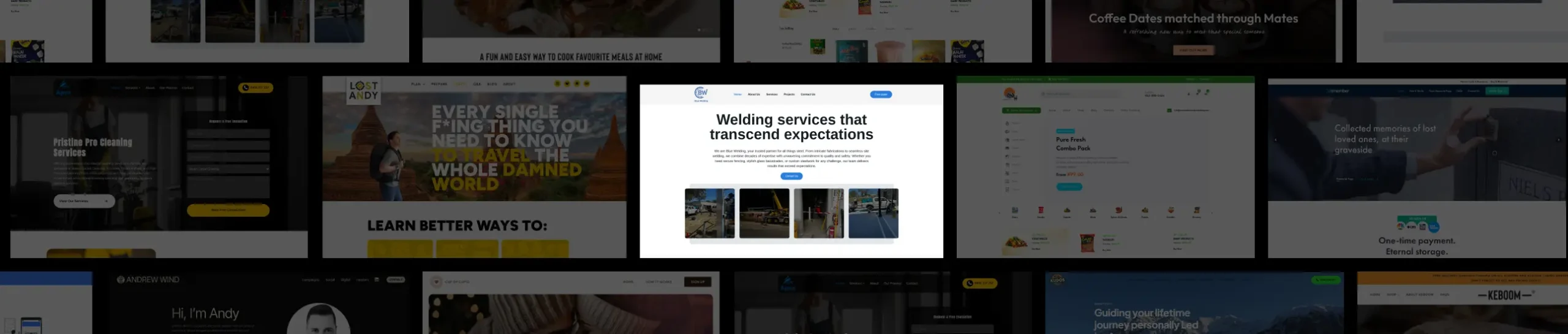

Blue Welding
Key Insights and Design Strategies Driving Blue Welding’s Website Development
Our Role
At Ikran Innovation, we designed and developed the Blue Welding website from scratch using WordPress and Elementor. Our focus was on creating a professional, responsive online presence that clearly communicates the company’s welding and fabrication services, showcases project capabilities, and makes it easy for potential clients to get in touch.
Team Structure
- 2 UX/UI Designers / DevelopersResearch Methods
- Competitor analysis, Usability review of similar welding/service websitesDiscipline
- UX Design, UI Design, Web DevelopmentPlatform
- Web and mobileTime Frame
- 1.5 monthsTechnology we used


Overview
Blue Welding, a Perth-based welding and metal fabrication company, needed a professional online presence to clearly communicate their services, showcase projects, and generate client inquiries. They partnered with Ikran Innovation to develop the website from scratch using WordPress and Elementor, creating a modern, intuitive, and engaging online experience.Outcomes
Improved service discoverability and highlighted project expertise
Created a seamless navigation flow to enhance user engagement
Strategic Value
Our development emphasized clear service presentation, project showcases, lead generation elements, and responsive design to drive engagement, client trust, and business growth.
Outcomes
60%
Increase in client inquiries within the first month
45%
Reduction in bounce rate due to improved navigation
99%
Positive client feedback on usability and design
“The newly developed website effectively communicates Blue Welding’s key services and capabilities in a visually appealing and professional way. Prospective clients can now quickly understand the company’s offerings, leading to a notable increase in inquiries and business opportunities.”

John Smith
Managing Director, Blue Welding
The Challenge
As Blue Welding was launching its first professional website, several challenges were identified that could impact user engagement and lead generation. These gaps made it harder for prospective clients to understand services, trust the company, and confidently reach out for inquiries.
Unclear Service Information: The range of welding and metal fabrication services was not clearly communicated, making it difficult for visitors to understand the company’s expertise and offerings.
Confusing Navigation Flow: Without an intuitive structure or clear calls-to-action, users could not easily find the information they needed, reducing the likelihood of submitting inquiries.
Limited Credibility Signals: The site initially lacked project showcases, client testimonials, and company background details, making it harder for first-time visitors to trust the business.
Note: The three primary issues identified were unclear service descriptions, non-intuitive navigation, and limited trust-building elements, each contributing to reduced client engagement.
To ensure the website effectively addressed these challenges, we conducted research and planning, including competitor analysis, usability testing, and consultation with the client. These insights guided our design and development process to create a clear, engaging, and trustworthy online presence for Blue Welding.
Research
To uncover the key factors behind limited client engagement and identify where users were encountering friction, we conducted:
Outcomes
Interviews with 10 prospective and existing clients to understand their information needs and decision-making process.
Competitive analysis of leading welding and fabrication service websites to identify best practices in layout, service presentation, and trust-building.
Usability testing on early wireframes and mockups to uncover navigation pain points and accessibility issues.
Strategic Value
This research enabled us to design and develop a website that clearly communicates Blue Welding’s services, showcases past projects, and builds credibility for first-time visitors.
Outcomes
Improved User Understanding: Identified gaps in service descriptions and content structure, enabling clear communication of expertise and capabilities.
Enhanced User Experience: Addressed navigation and layout issues to guide visitors smoothly to service pages and contact forms.
Trust Building: Highlighted opportunities to display client testimonials, certifications, and project case studies to increase credibility.
The research provided actionable insights into user behavior, service presentation, and competitive positioning. Leveraging these findings, we developed a fully functional website that enhances usability, encourages inquiries, and strengthens Blue Welding’s professional online presence.
Insights Recommendation
Insight 1
During our evaluation, we found that Blue Welding’s website initially lacked detailed service descriptions. Visitors struggled to understand the range of services offered, including welding, fabrication, and metal repairs. Only 62% of users reported feeling confident about what the company could provide after browsing the initial content.
Web
Mobile
The website did not prominently feature past projects or case studies. Users had difficulty visualizing the quality and scale of Blue Welding’s work, which reduced trust and engagement. Many visitors navigated away without exploring the full portfolio.
Web
Mobile
Unclear information on features like '50 broadcasts per month' and '30k messages per month' further added to the confusion. This ambiguity led to an impression of incompleteness, impacting user trust and decision-making.
Web
Mobile
The website’s calls-to-action (CTAs) were inconsistent and not visually distinct. Users often overlooked the contact forms and inquiry buttons, resulting in missed lead opportunities.
62% of users were unsure about the full range of services due to vague content.
Users struggled to find past project examples, weakening trust in the company’s capabilities.
Poorly structured navigation and unclear CTAs resulted in reduced engagement and inquiries.
This insight highlighted that without clear service descriptions, prominent project showcases, and intuitive navigation, potential clients were hesitant to reach out. Addressing these gaps became a priority to ensure visitors could quickly understand Blue Welding’s expertise, feel confident in the services, and be guided toward contacting the company.
Recommendation 1
To address the clarity and engagement issues identified, we recommended creating well-structured, detailed service pages and improving the visibility of past projects. By presenting information in an organized and visually appealing way, users could better understand Blue Welding’s offerings, see proof of expertise, and be guided naturally toward inquiries.
Web
Mobile
Create dedicated pages for each service (welding, fabrication, metal repairs) with detailed descriptions and benefits.

Incorporate high-quality images of completed projects to showcase workmanship and build trust.
Use case studies highlighting complex or notable projects to demonstrate expertise and experience.

Simplify navigation with clear menu categories and submenus for easy access to all services.
Add visually distinct CTAs on service and project pages to encourage inquiries and consultations.
Ensure consistent branding and tone across all content to reinforce professionalism and credibility.
Outcome
Enhanced user understanding of services, increased trust through visible project work, and a measurable boost in inquiries and engagement from potential clients.
Insight 2
During user observation and feedback analysis, we found that visitors struggled to quickly find contact information or request a quote. Many users navigated multiple pages or scrolled excessively to locate phone numbers or email addresses, which created friction in the conversion process.
Additionally, the lack of clearly defined call-to-action elements meant that even interested users were unsure how to proceed with inquiries or service requests, leading to potential leads being lost.
Contact information was not consistently visible across all pages.
Call-to-action buttons (e.g., “Request a Quote” or “Get in Touch”) were either missing or poorly placed.
Users had to scroll through long pages to find critical service and contact details.
These findings highlighted the need for a more intuitive and accessible contact and inquiry process. Making contact points prominent and integrating strong, well-positioned CTAs would reduce friction, improve user engagement, and increase the likelihood of generating leads.
Recommendation 2
To address the friction in contacting the company and requesting services, we emphasized clear and accessible communication channels throughout the website. By strategically placing contact information and prominent call-to-action buttons, users can immediately understand how to get in touch or request a quote without unnecessary navigation.
Web
Mobile
Integrate a fixed “Request a Quote” button and prominently display contact info (phone, email) on all pages to streamline lead generation.
Outcome
Enhanced user convenience and reduced friction in inquiries, resulting in higher lead submissions and improved engagement with prospective clients.
Insight 3
While navigating the service and project sections, users often struggled to quickly identify the full range of welding and fabrication services offered. The previous layout lacked clear hierarchy and visual cues, which made it difficult for first-time visitors to understand the company’s expertise at a glance.
Additionally, the project showcase section didn’t effectively communicate the scale, quality, or type of work completed. Users had to click multiple items to gather sufficient context, which increased bounce rates and reduced overall engagement.
Services needed to be grouped and labeled clearly to help users scan and understand offerings quickly.
Project images required consistent formatting and descriptive captions to communicate scope and quality.
Lack of visual hierarchy and cues caused hesitation in exploring services and trust in capabilities.
This insight highlighted the necessity for a more structured service section and a visually compelling project portfolio. Improving clarity and visual storytelling would allow visitors to immediately recognize Blue Welding’s expertise and the breadth of services, ultimately enhancing user confidence and engagement.
Recommendation 3
To improve clarity and user engagement, we recommended restructuring the service and project sections to clearly communicate Blue Welding’s expertise and showcase high-quality work. By emphasizing hierarchy, visual cues, and contextual descriptions, users could more easily understand the range and quality of services offered.
Web
Mobile
Organize services into clearly defined categories with concise headings and brief descriptions for quick scanning.
Standardize project images with descriptive captions and consistent layouts to communicate scope, materials, and quality of work.
These changes ensure visitors immediately understand the company’s capabilities, build trust through visual storytelling, and encourage deeper exploration of projects and services. The design improvements support user decision-making and reduce friction in navigating the website.
Outcome
Enhanced service visibility and project presentation led to increased user engagement, lower bounce rates, and higher inquiries from potential clients due to a clearer understanding of Blue Welding’s expertise and portfolio.
Insight 4
During usability testing and user feedback sessions, we observed that visitors often struggled to quickly locate contact information and request quotes. The placement of call-to-action buttons and contact forms was not prominent, which caused hesitation and reduced inquiry submissions.
Additionally, some service and project pages contained long blocks of text without visual breaks or cues, making it difficult for users to scan and digest information efficiently. Users preferred clear headings, bullet points, and visuals that highlighted key offerings.
Users had difficulty finding “Request a Quote” and contact details, affecting lead generation.
Long text blocks without formatting reduced content readability and engagement.
Lack of visual hierarchy made it challenging to distinguish between services and projects.
These insights revealed that improving content hierarchy, highlighting key actions, and using visual cues were essential for guiding users through the website effectively. Addressing these issues would enhance usability, encourage inquiries, and improve the overall user experience for Blue Welding’s website visitors.
Recommendation 4
To address the usability and engagement challenges identified, we recommended improving the visibility of key actions and enhancing content readability across the website. By emphasizing contact points and structuring information visually, users could navigate the site more intuitively and take desired actions with confidence.
Web
Mobile
Highlight “Request a Quote” buttons and contact information across all pages, ensuring they are easily accessible and visually prominent.
Break long text sections into headings, bullet points, and visual cues to improve readability and help users scan content quickly.
These improvements guide users through the site more efficiently, reducing friction in the decision-making process and making it easier for potential clients to engage with Blue Welding’s services.
Outcome
Enhanced user engagement, increased inquiry submissions, and a more intuitive browsing experience that strengthened the overall effectiveness of the website.
Insight 5
Users struggled to quickly find detailed information about the full range of welding services offered, including certifications, safety standards, and project capabilities. This lack of clarity made it harder for potential clients to assess the company’s expertise and suitability for their projects.
During testing and user observations, it became evident that service pages were dense with text and lacked visual hierarchy. Users often had to scroll excessively, which increased bounce rates and lowered engagement.
Service descriptions were too text-heavy, making it difficult to absorb key information.
Lack of visual cues such as icons, images, or infographics reduced engagement and comprehension.
Important details like certifications and safety standards were buried, impacting perceived credibility.
This insight highlighted the need for clearer presentation of service information and structured content to help users understand the company’s capabilities quickly and confidently, ultimately supporting better engagement and inquiries.
Recommendation 5
To improve user confidence and engagement, we focused on enhancing the clarity and credibility of service-related content across the website. By making important information immediately accessible and visually digestible, potential clients could quickly assess Blue Welding’s expertise and suitability for their projects.
Web
Mobile
Highlight certifications, safety standards, and project capabilities using badges, icons, and visual callouts to reinforce trust.
Use concise, structured content with headings, bullet points, and images to make service descriptions easy to scan and understand.
By implementing these strategies across service pages and the homepage, users were able to quickly grasp the company’s strengths, making the browsing experience more informative and confidence-inspiring.
Outcome
Enhanced user understanding, increased trust in Blue Welding’s expertise, and improved inquiries and lead generation through a more professional and credible online presence.
Looking for expert guidance?