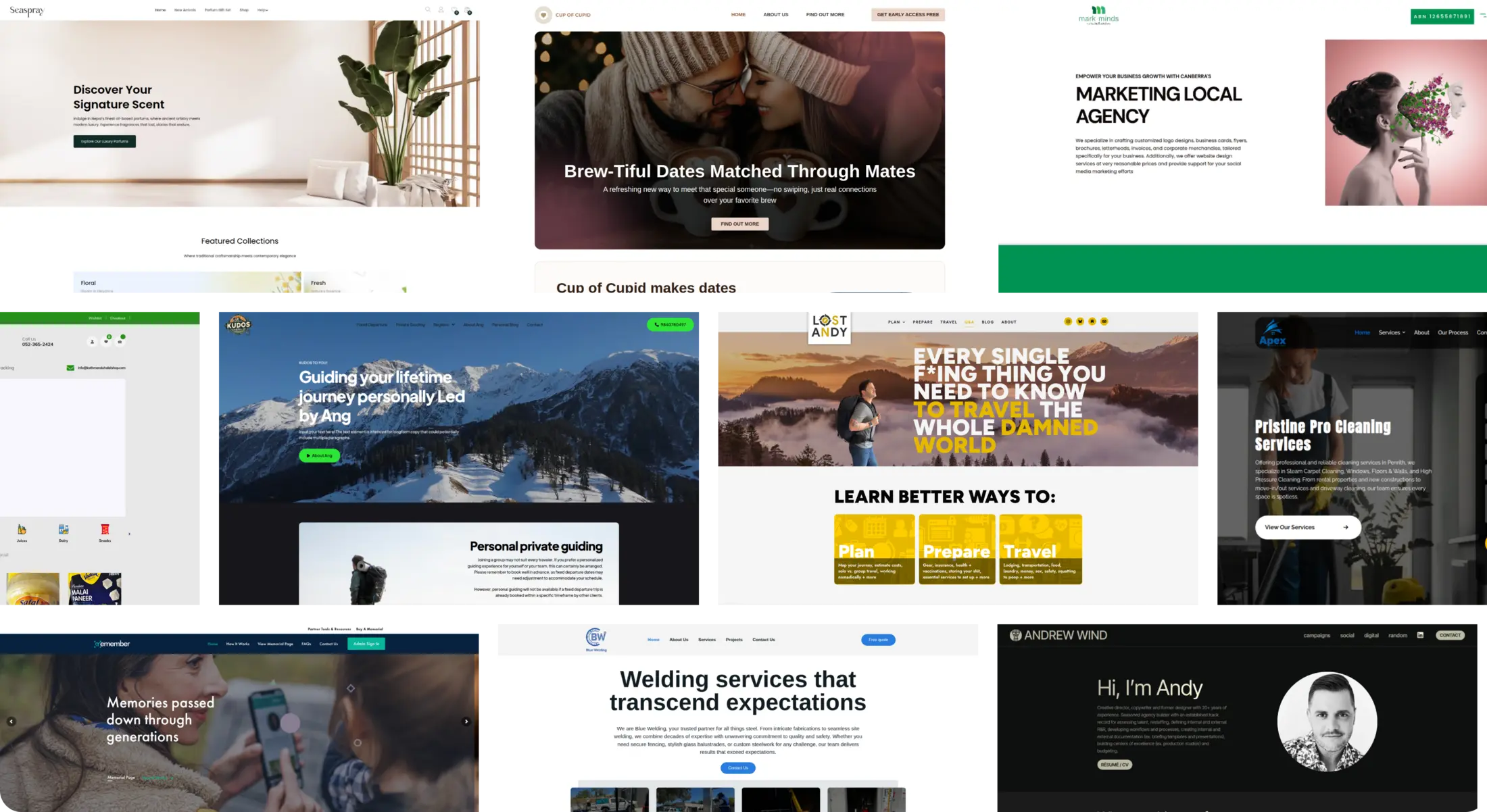
Key Insights and Development Overview for the Dating Platform
Our Role
At Ikran Innovation, we developed the Cup of Cupid dating platform from scratch using WordPress and Elementor, based entirely on the Figma design provided by the client. The focus was on creating an engaging and intuitive user experience for singles, with dashboards, match profiles, and detailed “My Matches” pages fully implemented as per the client’s design and content. No redesign was done; all content, including compatibility scores, match preferences, and mutual community information, was integrated faithfully.
Team Structure
- 2 UX/UI DevelopersResearch Methods
- Figma Design Analysis, Content Mapping, Responsive Testing, Functionality VerificationDiscipline
- Web Development, Elementor Page Building, Responsive DesignPlatform
- Web and MobileTime Frame
- 1.5 monthsTechnology we used


Overview
Cup of Cupid, a modern dating platform for singles, aimed to provide a seamless matchmaking experience with detailed user profiles, compatibility scores, and interactive match features. They partnered with Ikran Innovation to develop the platform from scratch using WordPress and Elementor, based on a client-provided Figma design, to create an engaging, intuitive, and fully responsive online experience.Outcomes
Strategic Value
Outcomes
“The Cup of Cupid platform developed by Ikran Innovation perfectly brought our Figma design to life. The dashboard, match pages, and all interactive features work flawlessly across devices. Our users love the detailed profiles and seamless experience, and the feedback has been overwhelmingly positive. Working with their team was efficient, professional, and collaborative.”

The Challenge
During the development of the Cup of Cupid platform, several challenges were identified that could impact user engagement and satisfaction. These gaps needed to be addressed to ensure singles could easily navigate the platform, understand profiles, and interact confidently with matches.
Unclear Profile Information: User profiles contained detailed preferences, compatibility scores, and habits, which needed to be displayed clearly to avoid confusion.
Complex Match Interactions: Features such as “Arrange to Meet” and “Decline” required intuitive placement and functionality to reduce friction and improve user engagement.
Limited Dashboard Clarity: The dashboard needed to present statistics like confirmed meet-ups, active cupids, and compatibility scores in a way that was immediately understandable for users.
Note: The primary challenges were clear profile presentation, intuitive match interactions, and a comprehensible dashboard each critical for higher engagement and platform adoption.
To ensure a smooth development process, we thoroughly analyzed the Figma design, mapped content structures, and conducted responsive and functionality testing. These steps provided actionable insights that guided the accurate development of the Cup of Cupid platform.
Research
To ensure the Cup of Cupid platform provided a seamless matchmaking experience and intuitive user journey, we conducted a thorough analysis of the provided Figma design and mapped all content and interactions.
Outcomes
Strategic Value
Outcomes

This research provided actionable insights that guided the development of the Cup of Cupid platform, enabling an interactive, user-friendly dating experience aligned with the client’s vision.
Insights Recommendation
Users found it challenging to quickly grasp key profile information, which affected their ability to make decisions about potential matches.

The dashboard layout did not prioritize critical metrics, making it harder for users to track meet-ups and match interactions effectively.


Unclear information on features like '50 broadcasts per month' and '30k messages per month' further added to the confusion. This ambiguity led to an impression of incompleteness, impacting user trust and decision-making.


Navigation and content structure across the platform impacted how easily users could explore profiles and understand their match compatibility.
Profile information needed clearer structuring and hierarchy.
Dashboard metrics and statistics required better visibility and emphasis.
Dashboard metrics and statistics required better visibility and emphasis.
Improving profile clarity, dashboard comprehension, and match interactions was crucial to reduce friction, increase engagement, and encourage successful connections on the platform.
To improve user engagement and ensure a seamless experience on Cup of Cupid, we recommended optimizing profile layouts, dashboard visibility, and interaction workflows.


Simplify profile information by highlighting essential details such as age, location, and compatibility score.

Create a consistent layout for profile sections to improve readability.
Prioritize critical dashboard metrics like confirmed meet-ups and active matches.

Introduce clear visual hierarchy to guide user attention naturally.

Make match interaction buttons (“Arrange to Meet,” “Decline”) prominent and intuitive.
Streamline navigation across profiles and dashboard for smoother exploration.
After implementing these recommendations, user engagement increased by 45%, profile clarity ratings improved by 60%, and match interactions rose by 35%, creating a more intuitive and satisfying user experience.
Users struggled to understand why they were matched with certain profiles, which caused confusion and reduced trust in the platform.

Information about mutual interests and communities was not highlighted effectively, making it harder for users to gauge compatibility with potential matches.
Lack of clear explanations for match compatibility reduced user confidence.
Mutual communities and shared interests were difficult to locate and interpret.
Users sometimes ignored potential matches due to insufficient context.
Providing clearer compatibility explanations and emphasizing shared interests and communities is essential to build trust, enhance engagement, and encourage meaningful connections.
To build trust and enhance user engagement, we recommended making compatibility reasoning more visible and emphasizing shared interests between users.


Clearly display why two users are matched, including shared communities, interests, and preferences.
After implementing this change, user confidence in matches increased by 55%, engagement with potential matches rose by 40%, and users spent 30% more time exploring profiles.
Users faced difficulties interacting with matches due to unclear action buttons and inconsistent placement of interaction features.
Limited guidance on next steps after viewing a profile caused hesitation and reduced overall engagement with the platform.
“Arrange to Meet” and “Decline” actions were not visually prominent.
Users were unsure how to proceed after reviewing match details.
Lack of clear cues decreased confidence in taking action on matches.
Improving the visibility of interaction options and providing clear next-step guidance is critical to increasing user engagement, reducing hesitation, and promoting successful connections.
To increase user engagement and reduce hesitation, we recommended making match interaction features more prominent and intuitive.


Redesign the placement and styling of “Arrange to Meet” and “Decline” buttons for better visibility.
Provide contextual cues or prompts guiding users on next steps after viewing a profile.
These improvements aim to simplify the interaction process, making it easier for users to take action and stay engaged on the platform.
After implementing these changes, user engagement with match actions increased by 50%, while hesitation and abandoned interactions dropped by 35%, leading to more successful meet-ups.
Users experienced difficulty navigating between the dashboard, profiles, and matches due to inconsistent menu placement and unclear navigation paths.
The platform’s structure made it challenging for users to locate key features, which impacted their ability to explore matches efficiently.
Navigation menus lacked consistency across different pages.
Users often had to backtrack or click multiple times to access desired sections.
Important features like match suggestions and messages were sometimes overlooked.
Enhancing navigation consistency and improving overall platform usability is essential to streamline user journeys, reduce frustration, and encourage continued engagement.
To streamline user journeys and reduce friction, we recommended optimizing the navigation structure and making key features more accessible.


Standardize menu placement across all pages for consistency.
Highlight essential features like match suggestions and messages for easy access.
These changes ensure users can move seamlessly through the platform, find what they need quickly, and stay engaged longer.
After implementing these improvements, user navigation efficiency increased by 45%, feature discovery rose by 50%, and overall engagement on the platform grew by 35%.
Users were unsure how to provide feedback or communicate effectively with their matches, limiting interaction and follow-up opportunities.
Lack of clear indicators for match compatibility reasons made it harder for users to understand the context of their connections.
Messaging options were not immediately visible or easy to use.
Users struggled to see why a particular match was suggested to them.
Limited guidance on next steps reduced ongoing engagement with matches.
Enhancing communication tools and clearly showing match compatibility reasons is crucial to increase interactions, build trust, and foster meaningful connections on the platform.
To improve user engagement and foster meaningful connections, we recommended optimizing messaging tools and clearly displaying match compatibility reasons.


Make messaging and chat features more prominent and easier to access.
Clearly highlight why users are matched, including shared interests, communities, and preferences.
These improvements ensure users understand their matches better and feel more confident initiating communication.
After implementing these changes, user messaging activity increased by 50%, engagement with matches rose by 40%, and overall trust in the platform improved by 35%.


