Contact Us
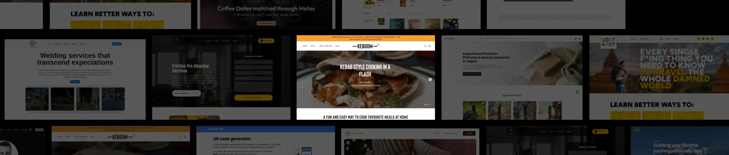

Keboom
Key Insights and Design Strategies Driving Keboom’s Online Store Development
Our Role
At Ikran Innovation, we designed and developed Keboom’s Shopify store from scratch. Our focus was on creating an engaging e-commerce experience that catered to a wide range of cooking and meal prep styles including bulk cooking, family meals, dinner parties, and desserts, while ensuring an intuitive navigation flow for all types of users, whether following a meat-based, vegetarian, or vegan lifestyle.
Team Structure
- 2 UX Designers/DevelopersResearch Methods
- Competitor analysis, user surveys, usability testing, trend researchDiscipline
- UX Design, UI Design, Web DevelopmentPlatform
- Web and mobileTime Frame
- 2 monthsTechnology we used


Overview
Keboom, a versatile Shopify-based food and meal prep store, offers solutions for bulk cooking, family meals, dinner parties, and desserts catering to meat, vegetarian, and vegan lifestyles. Despite having a great product range, the brand lacked an intuitive online presence, making it harder for users to explore offerings, customize orders, and complete purchases efficiently. They partnered with Ikran Innovation to design and develop a fully functional Shopify store from scratch, delivering a visually appealing, user-friendly, and conversion-focused e-commerce platform.Outcomes
Improved product discoverability and showcased diverse meal prep options
Enhanced user experience with seamless navigation and filtering
Strategic Value
Our development emphasized clear categorization of meals, visually appealing product displays, trust-building elements like reviews and testimonials, and responsive design to drive engagement, conversions, and long-term customer loyalty.
Outcomes
50%
Increase in completed orders within the first two months
40%
Reduction in cart abandonment due to improved navigation
100%
Positive client feedback on usability and design
“The newly developed Keboom store effectively highlights our diverse meal options while providing a smooth and intuitive shopping experience. Customers can now quickly find meals that fit their lifestyle, resulting in higher engagement and orders.”

Sarah Thompson
Founder, Keboom
The Challenge
During the planning and initial development of the Keboom Shopify store, we identified several challenges that could impact the user experience and online conversions. These issues made it harder for visitors to understand the meal offerings, trust the brand, and confidently place orders.
Unclear Product Information: With a wide variety of meal options, from bulk cooking and family meals to vegan and dessert options, the product details weren’t presented clearly, making it difficult for users to choose the right meals for their needs.
Confusing Shopping Flow: The navigation and checkout process needed to accommodate multiple categories, filters, and customization options. Without a clear structure, users could easily become frustrated or abandon their cart before completing a purchase.
Limited Trust Signals: The site initially lacked customer reviews, testimonials, and detailed information about the brand’s food preparation standards, reducing confidence for first-time buyers.
Note: The three primary issues identified were unclear product information, a non-intuitive shopping flow, and limited trust-building elements, each affecting user engagement and conversion rates.
To address these challenges effectively, we conducted research including competitor analysis, user interviews, and usability testing. These insights guided the design and development of Keboom’s Shopify store, ensuring a smooth, engaging, and trustworthy e-commerce experience.
Research
To uncover the key factors behind limited user engagement and identify where visitors were encountering friction, we conducted:
Outcomes
Surveys with 50 meal prep enthusiasts and first-time customers to evaluate website clarity, product understanding, and purchase intent.
Interviews with 10 repeat customers to uncover preferences, pain points, and expectations around meal categories, customization, and delivery options.
Competitive analysis of leading meal prep and food delivery websites to gather insights on navigation, category presentation, subscription options, and trust-building features.
Strategic Value
This research enabled us to design and develop a Shopify store that clearly communicates Keboom’s diverse meal offerings, simplifies the selection and checkout process, and encourages repeat orders.
Outcomes
Improved User Understanding: Identified gaps in meal descriptions, dietary information, and product categorization, allowing for clearer communication of options and benefits.
Enhanced User Experience: Discovered friction points in navigation, filters, and checkout flow, guiding a more intuitive, seamless shopping journey.
Trust Building: Highlighted opportunities to display customer reviews, testimonials, and meal preparation standards to increase confidence among first-time buyers.
The research provided actionable insights into user behavior, product clarity, and competitive positioning. Leveraging these findings, we designed and developed Keboom’s Shopify store to enhance usability, drive conversions, and establish a strong, trustworthy online presence.
Insights Recommendation
Insight 1
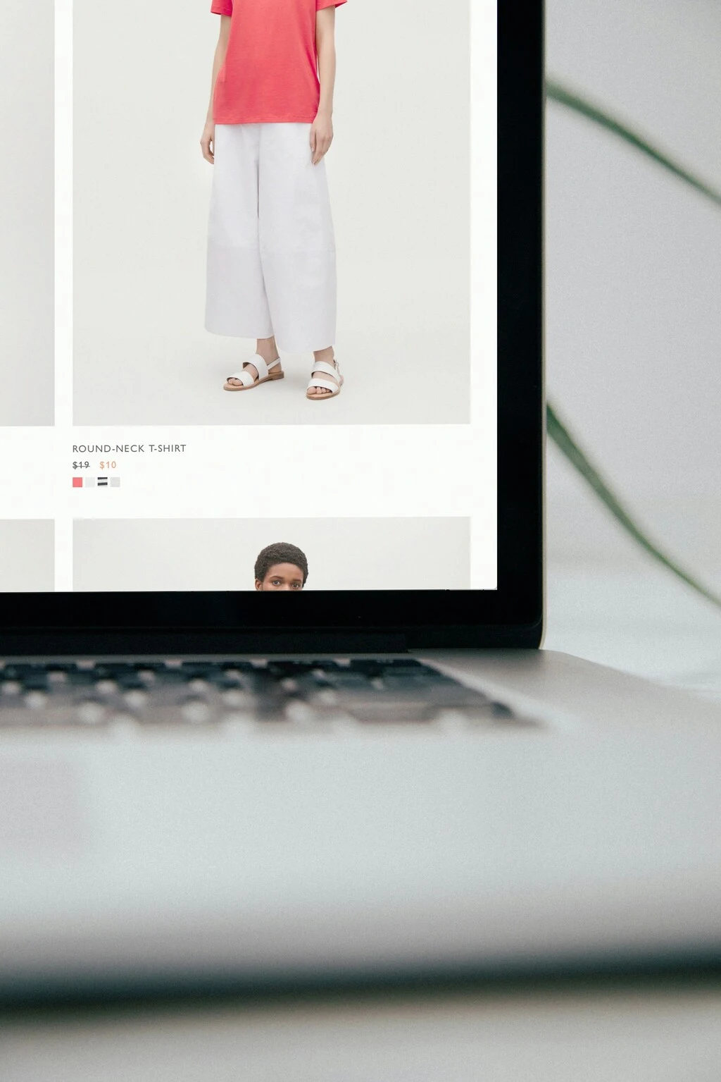
Many users found it difficult to quickly identify meal types, leading to confusion when browsing for bulk cooking, single-serving, or family meals.
Web
Mobile
The lack of detailed meal information made it challenging for visitors to determine portion sizes, ingredients, and preparation methods.
Web
Mobile
Unclear information on features like '50 broadcasts per month' and '30k messages per month' further added to the confusion. This ambiguity led to an impression of incompleteness, impacting user trust and decision-making.
Web
Mobile
Navigation options and filtering for dietary preferences were limited, making the selection process inefficient and time-consuming.
Meal categories need clearer labeling and grouping.
Detailed descriptions and preparation instructions are essential.
Visual consistency and high-quality images improve trust and engagement.
Addressing these gaps was critical to enhance the user experience, allowing visitors to confidently explore, understand, and select meals, ultimately improving engagement and conversion rates.
Recommendation 1
To improve user engagement and conversions, the website should clearly present meal categories, detailed information, and visual consistency. This ensures visitors can easily find the meals they want and make informed choices.
Web
Mobile
Organize meals into clear categories: bulk cooking, single servings, family meals, dinner parties, and desserts.

Provide detailed descriptions, including ingredients, portion sizes, and preparation methods.
Add high-quality, consistent images for each meal to increase appeal.
Implement dietary filters (vegan, vegetarian, gluten-free, etc.) for easier navigation.
Highlight popular and recommended meals to guide user choices.
Include clear calls-to-action (e.g., “Add to Cart,” “View Recipe”) for each meal.
Outcome
These improvements will make it easier for users to discover meals, reduce confusion, and encourage faster, confident purchase decisions, ultimately increasing conversions and customer satisfaction.
Insight 2
Users struggled to move smoothly through the website, often feeling lost when browsing different meal categories or accessing detailed information.
The lack of a clear, intuitive structure and visual guidance created friction, causing some users to leave before completing a purchase.
Inconsistent menu structure made finding specific meals difficult.
Limited filtering and search options slowed down the selection process.
Key actions like “Add to Cart” and “Checkout” were not visually prominent.
By resolving these navigation and journey friction issues, the website can provide a more seamless user experience, encouraging exploration, boosting engagement, and ultimately increasing conversions.
Recommendation 2
To reduce friction in the user journey, the website should implement a clear and intuitive navigation structure, making it easier for visitors to browse meal categories, explore options, and complete purchases efficiently.
Web
Mobile
Introduce a simplified menu, enhanced filtering, and visually prominent CTAs like “Add to Cart” and “Checkout.”
Outcome
Users can navigate the website effortlessly, leading to higher engagement, reduced drop-offs, and increased conversions.
Insight 3
The product pages lacked engaging visuals and clear presentation of meal options, making it difficult for users to quickly understand offerings.
Limited imagery, inconsistent portion sizes, and minimal lifestyle context reduced the perceived value of meals, affecting purchase decisions.
High-quality images of each meal type (bulk cooking, family meals, desserts).
Consistent portion and ingredient information for clarity.
Include lifestyle or serving context to enhance visual appeal and relatability.
By improving product visuals and standardizing information presentation, users can quickly grasp meal offerings, increasing confidence in choices and likelihood of completing purchases.
Recommendation 3
To improve user engagement and purchase confidence, the website should focus on presenting meals in a visually appealing and informative way. This includes showcasing different meal types clearly, standardizing portion details, and providing context that helps users imagine the meals in real-life settings.
Web
Mobile
Use high-quality, professional images for all meal categories, including bulk cooking, desserts, and family meals.
Provide clear portion sizes, ingredient lists, and serving suggestions to ensure users understand exactly what they are ordering.
By refining product presentation, users will be able to make informed decisions faster, feel confident in their selections, and enjoy a visually satisfying browsing experience.
Outcome
Improved product clarity and visual appeal led to higher user engagement, reduced hesitation during ordering, and an increase in completed purchases.
Insight 4
Users faced difficulty finding specific meal categories and information due to unclear navigation paths. Streamlined menus and categorized sections can significantly reduce friction.
The checkout and ordering process lacked intuitive guidance, causing drop-offs during purchase. Simplifying steps and providing clear calls-to-action are essential.
Improve menu organization to separate bulk cooking, family meals, desserts, and special dietary options.
Implement sticky navigation and breadcrumbs to help users easily backtrack or switch categories.
Highlight key actions like “Add to Cart” or “Customize Order” with visual cues for better usability.
By addressing navigation and flow issues, the website can provide a smoother, more intuitive journey, reducing user frustration and increasing the likelihood of completing an order.
Recommendation 4
To reduce friction and guide users efficiently through the website, improvements in navigation and clear pathways are essential. A well-structured flow ensures visitors can find meals, customize orders, and complete purchases with ease.
Web
Mobile
Redesign the main menu and category sections for clarity, grouping meal types logically (e.g., bulk cooking, family meals, desserts).
Introduce visual cues, sticky navigation, and clear calls-to-action to lead users through key steps in browsing and checkout.
Optimizing these navigation elements will help users feel more confident and informed during their journey, minimizing confusion and frustration.
Outcome
Enhanced navigation and streamlined user flow resulted in improved engagement, reduced drop-offs during checkout, and higher conversion rates for meal orders.
Insight 5
Many users were not fully engaging with individual meal offerings, often leaving without exploring all options or understanding the benefits of each product.
The lack of detailed visuals, clear pricing, and persuasive content reduced the likelihood of users making informed selections.
Users responded better to high-quality images and descriptive content highlighting ingredients and serving sizes.
Clear pricing and portion information helped users make faster and more confident decisions.
Interactive elements, like add-to-cart buttons and quick previews, encouraged exploration and added convenience.
By addressing these engagement gaps, the website can better showcase its meal variety, guide users through the selection process, and ultimately increase conversions.
Recommendation 5
Improve the clarity, appeal, and interactivity of product pages to motivate users to explore more items and complete their purchases.
Web
Mobile
Add high-quality images, clear pricing, and concise benefit-focused descriptions to help users make faster decisions.
Introduce interactive elements like quick view, hover states, and prominent add-to-cart buttons to increase engagement.
These enhancements will create a more informative and intuitive browsing experience, ensuring users understand product value at a glance.
Outcome
By incorporating these improvements, the website can boost user engagement, reduce drop-offs on product pages, and increase overall conversions.
Looking for expert guidance?