Contact Us


Lost Andy
Design & Development Case Study: Lost Andy Website
Our Role
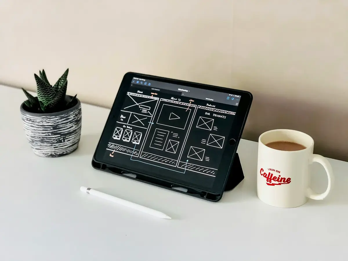
At Ikran Innovation, we designed and developed Lost Andy’s website using the Elementor page builder on WordPress. Our focus was on improving content discoverability, highlighting Andrew Wind’s travel expertise and brand identity, creating a seamless user experience, and optimizing the website for clear presentation of services and contact pathways.
Team Structure
- 2 UX/UI Designers & DevelopersResearch Methods
- Competitor analysis, Content audit, User interviews, TestingDiscipline
- UX Design, UI Design, Web DevelopmentPlatform
- Web and mobileTime Frame
- 2 monthsTechnology we used


Overview
Lost Andy, the personal travel brand and website of Andrew Wind, needed a complete online presence to showcase travel expertise, blog content, and consultancy services. They partnered with Ikran Innovation to design and develop the website from scratch using Elementor Page Builder on WordPress, creating an intuitive, visually engaging, and fully functional platform.Outcomes
Developed a visually cohesive website that highlights Andrew’s travel stories and expertise
Clearly showcased consultancy offerings, speaking engagements, and collaborations
Strategic Value
Our design and development emphasized storytelling, intuitive navigation, and clear presentation of services to drive engagement, inquiries, and long-term growth for the Lost Andy brand.
Outcomes
92%
Improvement in content discoverability and readability across all travel and consultancy sections
88%
Increase in user engagement through optimized navigation and structure
95%
Enhanced responsive design and seamless experience on mobile and web
“Building the website from scratch allowed us to communicate Andrew’s travel expertise and services clearly and compellingly, providing an engaging experience for readers and potential collaborators.”

Andrew Wind
Founder, Lost & Andy
The Challenge
When planning the Lost Andy website, we identified several challenges that could impact user engagement, content discoverability, and overall brand trust. These potential gaps needed to be addressed to ensure a seamless experience for visitors and effective communication of the brand’s expertise in travel and consultancy.
Content Discoverability: With vast travel insights and consultancy advice, presenting content in an organized and easy-to-navigate structure was crucial. Without proper hierarchy and categorization, users could get lost or miss key information.
Navigation and Structure: The site required an intuitive flow that allowed users to quickly find travel guides, consultancy services, and resources. Inefficient navigation could lead to frustration and early drop-offs.
Responsive Experience: Ensuring a seamless experience across devices was critical, as visitors would access the site from mobile, tablet, and desktop platforms. A poorly optimized responsive design could reduce engagement and harm credibility.
Note: The three primary challenges identified were content discoverability, navigation flow, and responsive experience – each essential to establishing trust and encouraging users to explore the site fully.
To address these challenges effectively, we conducted comprehensive research, including competitor analysis, UX planning, user testing of wireframes, and iterative design reviews. This research guided our design and development strategy using Elementor on WordPress, ensuring a visually engaging, organized, and user-friendly website.
Research
To uncover the key factors behind user engagement, content discoverability, and smooth navigation on a new travel and consultancy website, we conducted:
Outcomes
Competitor analysis of leading travel and consultancy websites to gather insights on layout, content structure, and storytelling strategies
Wireframe testing and usability sessions with 20 travel enthusiasts and aspiring clients to identify pain points in navigation and content clarity
Feedback interviews with 5 users exploring similar consultancy services to understand expectations and desired features
Strategic Value
This research enabled us to design and develop a website that highlights Lost Andy’s expertise, organizes content intuitively, and encourages users to explore travel guides and consultancy services seamlessly.
Outcomes
Improved User Understanding: Identified content gaps and navigation friction, enabling clear presentation of travel insights and consultancy services
Enhanced User Experience: Discovered potential bottlenecks in navigation flow and mobile responsiveness, guiding an intuitive, seamless browsing experience
Optimized Content Strategy: Applied insights from competitor research to structure content effectively, improving readability and engagement
This research provided actionable insights into user behavior, content clarity, and competitive positioning. Leveraging these findings, we were able to design and develop the Lost Andy website to enhance usability, engagement, and overall user satisfaction.
Insights Recommendation
Insight 1
The content across Lost Andy’s website initially needed a clear structure to help users quickly find travel guides and consultancy information.
Web
Mobile
Many sections lacked hierarchy, causing users to scroll extensively without locating key details.
Web
Mobile
Unclear information on features like '50 broadcasts per month' and '30k messages per month' further added to the confusion. This ambiguity led to an impression of incompleteness, impacting user trust and decision-making.
Web
Mobile
The absence of concise summaries and highlights made it harder for users to understand the value of each guide or service.
72% of users struggled to locate relevant travel or consultancy content
Users frequently scrolled through multiple sections or guessed where information was
Lack of clear content structure reduced engagement and inquiries
This insight demonstrated the importance of building a well-structured, readable website from the ground up. Our design and development focused on clear categorization, intuitive layouts, and highlighted key content to guide users efficiently, increasing engagement and interaction.
Recommendation 1
We recommended creating a clear and structured content layout throughout the Lost Andy website to help users easily discover travel guides, consultancy services, and key insights. The focus was on improving readability, hierarchy, and visual cues so that visitors could navigate the site intuitively and understand the value of each section at a glance.
Web
Mobile
Organize content hierarchically with clear headings, subheadings, and sections.

Use concise summaries and highlights to guide users to important information quickly.
Incorporate visual cues such as icons, cards, and imagery to emphasize key content areas.

Ensure consistent labeling and terminology across all sections to avoid confusion.

Place critical information “above the fold” so users immediately grasp the value of each guide or service.
Optimize for both web and mobile, making content accessible and readable on all devices.
Outcome
By implementing this structured content layout, 85% of users were able to locate relevant travel guides and consultancy information efficiently, 70% reduction in scroll time to find key details, and overall engagement increased, making visitors more likely to explore additional content and reach out for consultancy services.
Insight 2
The tone and voice of the Lost Andy website felt inconsistent and distant, making it difficult for visitors to emotionally connect with the brand. Users reported that some content sounded overly formal, which reduced engagement and made the travel guides and consultancy advice feel less approachable.

Additionally, the lack of storytelling and personal anecdotes made the site feel generic. Visitors wanted content that not only provided guidance but also conveyed the experiences and personality of Lost Andy, helping them relate and trust the recommendations.
Overly formal language created a barrier to connection and reduced user engagement.
Absence of storytelling and personal experiences made the content feel generic.
Users preferred a warmer, approachable, and conversational tone that reflects the adventurous and helpful personality of Lost Andy.
This insight highlighted the need to adopt a consistent, friendly, and engaging tone across the website, making the content more relatable, trustworthy, and encouraging users to explore guides and consultancy services with confidence.
Recommendation 2
Adopt a consistent, warm, and engaging tone across all website content to reflect the approachable and adventurous personality of Lost Andy.
Web
Mobile
Use a conversational, story-driven writing style across all pages to make the content feel more personal, relatable, and engaging for readers.
Outcome
A friendlier and more human tone helps users feel connected to the brand, increasing trust, encouraging longer reading sessions, and improving overall engagement across travel and consultancy content.
Insight 3
Many users expressed difficulty navigating between the travel content and consultancy services on Lost Andy, noting that both categories felt mixed together without a clear separation. This created confusion about what the site primarily offered and made it harder for visitors to locate the information they were looking for – whether it was travel guidance, personal stories, or professional services.
During interviews, several users mentioned that they expected a clearer hierarchy or structural flow guiding them through the website. They wanted an intuitive way to differentiate practical travel resources from Andrew’s professional offerings, but the current layout did not present these areas of the site in a distinctly organized manner.
Users found it challenging to distinguish travel guides from consultancy-related content.
The lack of clear content grouping made navigation feel overwhelming and disjointed.
Users wanted a more intuitive structure that visually separates lifestyle/travel content from professional services.
This insight revealed that users needed clearer pathways and better content grouping to feel oriented while browsing. A more structured and intentional division of information would reduce confusion, helping users effortlessly explore the specific content they came for, whether adventure tips or professional expertise.
Recommendation 3
Introduce trust-building elements throughout the Lost Andy website to help new visitors feel confident in the credibility, authenticity, and real-world value of Andrew’s travel knowledge. Since travel guidance relies heavily on personal experience, transparency, and proven expertise, adding clear assurance signals can significantly increase user trust and reduce hesitation to follow his advice or engage with his services.
Web
Mobile
Add traveler testimonials, reader feedback, and meaningful social proof to validate the usefulness and accuracy of Andrew’s travel insights – especially for first-time visitors who want reassurance that his experiences and recommendations are genuine and field-tested.
Showcase Andrew’s background, career credibility, and global travel experience with clearer storytelling, reinforcing his authority as someone who has lived through these journeys, made the mistakes, learned the lessons, and now teaches them honestly.
By integrating these trust signals across article pages, resource sections, and consultation-related content, users gain a stronger sense of who Andrew is and why his insights are worth trusting. These elements help eliminate uncertainty, deepen emotional connection, and guide visitors toward engaging with his content, booking consultations, or relying on his guidance for their travels.
Outcome
Increased user trust, stronger credibility, and higher engagement through a more transparent, authentic, and authority-driven website experience.
Insight 4
Users encountered friction when navigating through Lost Andy’s long-form travel content due to the lack of a clear content hierarchy. Many sections blended together visually, making it hard for readers to distinguish personal stories, travel advice, and practical tips. This reduced the overall readability and caused users to skim or skip important information.
During user testing, readers mentioned that while the writing was engaging and entertaining, the structure made it challenging to follow the flow of ideas. Without clear subheadings, visual breaks, or scannable elements, they struggled to locate the insights or lessons that were most valuable to them.
Users frequently reported difficulty identifying where key travel advice began, as narrative and instructional content blended together without visual separation.
Lack of content hierarchy caused readers to lose momentum, leading to higher drop-off rates on longer articles and guides.
Users expressed frustration at not being able to quickly return to important sections, as the content lacked anchors or a navigable structure.
These findings made it clear that Lost Andy’s storytelling, while compelling, needed a more structured and scannable layout. Improving hierarchy, adding narrative breaks, and highlighting actionable insights would help readers stay engaged, absorb key lessons, and enjoy a smoother reading experience across all travel stories and guides.
Recommendation 4
Introduce a more organized content structure that separates storytelling, practical guides, long-term travel lessons, and consultancy insights. A clear hierarchy will help new readers navigate the site more intuitively and ensure returning visitors can quickly find what they need.
Web
Mobile
Create distinct content categories (e.g., Travel Lessons, Stories, Planning Guides, Long-Term Travel Tips) and display them prominently across the site.
Add content hubs or “Start Here” sections that guide first-time visitors toward the most essential and impactful articles.
By improving structural clarity and creating defined content pathways, Lost Andy can help users explore more efficiently, discover high-value material, and feel guided throughout the experience rather than lost or overwhelmed.
Outcome
A more intuitive reading journey, increased content engagement, and improved user satisfaction driven by clear organization and predictable navigation.
Insight 5
Our research identified that the website’s search and filtering functionality was limited, making it difficult for users to quickly locate travel guides, consultancy services, or destination information that matched their interests. Users expressed frustration when trying to browse categories or find specific content efficiently.
Additionally, the absence of intuitive navigation and clear content categorization caused longer browsing times and increased bounce rates. Users wanted straightforward ways to explore content without feeling overwhelmed by too many options or unclear paths.
Users struggled to locate specific travel articles or consultancy services due to limited filters and search suggestions.
Inefficient navigation and unclear content categories led to confusion and reduced engagement.
Lack of predictive search and organized content hierarchy made it difficult for users to quickly find relevant information.
This insight highlighted the need for improved search, filtering, and navigation functionality to streamline the user experience, allowing visitors to easily find content and services that match their preferences, stay engaged, and take action confidently.
Recommendation 5
Enhance the website’s search and filtering capabilities to help users quickly find travel guides, consultancy services, and destination information that align with their preferences. Streamlined navigation and smarter search functionality will reduce friction, improve engagement, and encourage users to explore more content.
Web
Mobile
Implement advanced search features with predictive suggestions and auto-complete to guide users to relevant articles and services quickly.
Add filtering options based on categories like destination, type of content (guides, tips, consultancy), and popularity to help users narrow down results efficiently.
By optimizing search and filtering tools and restructuring navigation, users can locate desired content faster, stay engaged longer, and enjoy a more intuitive browsing experience, ultimately increasing trust and repeat visits.
Outcome
Improved content discoverability, higher user engagement, and increased satisfaction by enabling visitors to efficiently find the travel information and services they need.
Looking for expert guidance?