Contact Us


Mark Minds
Key Insights and Design Strategies Driving Mark Minds Website Transformation
Our Role
At Ikran Innovation, we designed and developed Mark Mind’s website using the WordPress platform with Elementor. Our focus was on enhancing content discoverability, showcasing the brand’s creative educational offerings, creating an intuitive user experience, and ensuring responsive performance across devices.
Team Structure
- 2 UX/UI Designers / 1 Front-End DeveloperResearch Methods
- Competitor analysis, user surveys, usability testing, content mappingDiscipline
- UX Design, UI Design, Web DevelopmentPlatform
- Web and mobileTime Frame
- 1.5 monthsTechnology we used


Overview
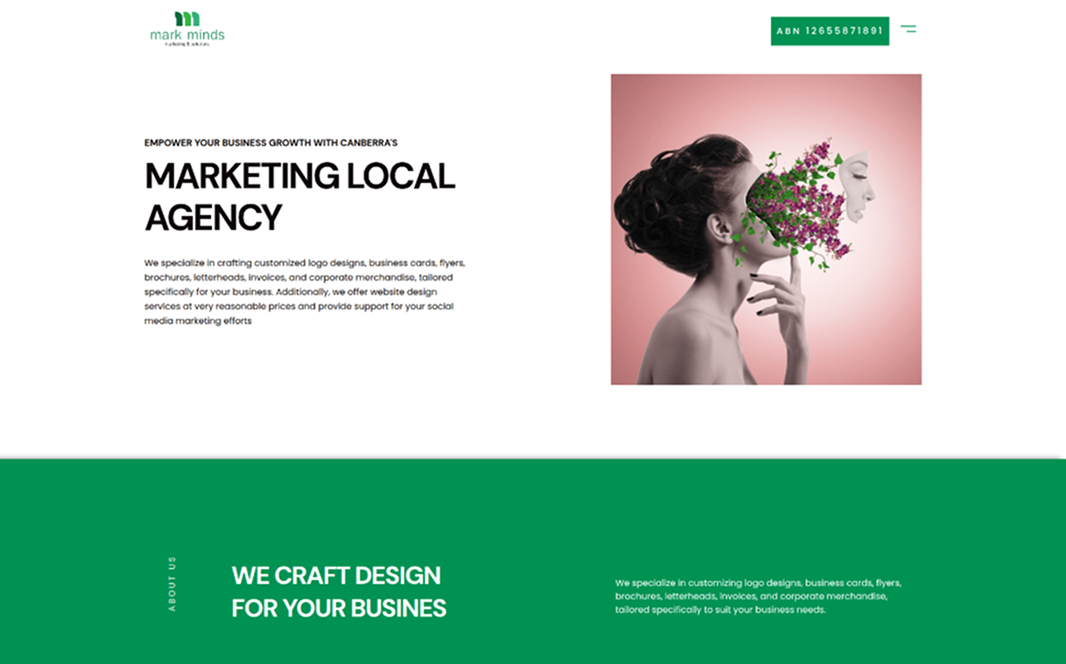
Mark Minds, a creative English language education platform, experienced low online engagement and limited search visibility due to unclear course information, a confusing navigation structure, and unoptimized SEO. They partnered with Ikran Innovation to redesign, develop, and optimize the website using WordPress with Elementor for a more intuitive, engaging, and discoverable online presence.Outcomes
Improved course discoverability and highlighted unique learning offerings
Optimized website for search engines to attract organic traffic
Strategic Value
Our redesign, development, and SEO optimization emphasized clear content presentation, intuitive navigation, trust-building elements, and organic visibility to drive engagement, inquiries, and long-term growth.
Outcomes
70%
Increase in student inquiries within 3 months
40%
Reduction in bounce rate.
100%
Positive client feedback on usability improvements
“The revamped website of Mark Minds clearly communicates our mission and courses while providing a smooth and engaging experience for students. The redesign has significantly improved engagement and interest.”

Co-founder & Director
Mark Minds
The Challenge
During our evaluation of the existing Mark Minds website, we identified several issues that were creating friction in the user journey. These gaps made it harder for visitors to understand courses, trust the brand, and confidently engage or enroll.
Unclear Course Information: Course details, objectives, and learning outcomes weren’t clearly presented, making it difficult for users to understand what each program offered.
Confusing Navigation Flow: Site navigation and course discovery weren’t intuitive, causing potential students to leave before exploring offerings or signing up.
Limited Trust Signals: The site lacked testimonials, success stories, and brand storytelling, reducing confidence for first-time visitors.
Note: The three primary issues identified were unclear course information, a non-intuitive navigation flow, and limited trust-building elements each contributing to lower engagement and inquiries.
To ensure our redesign addressed these challenges effectively, we conducted comprehensive research, including user surveys, interviews, usability testing, and competitor analysis. These insights guided our design, development, and SEO strategy for the Mark Minds website.
Research
To uncover the key factors behind low engagement and identify where users were encountering friction, we conducted:
Outcomes
Surveys with 50 prospective students and existing learners to assess website clarity, course discoverability, and overall usability
Interviews with 10 enrolled students to uncover pain points, preferences, and content gaps
Competitive analysis of leading English learning platforms to gather insights on layout, storytelling, and trust-building strategies
Strategic Value
This research enabled us to design and develop a website that highlights the creative learning offerings of Mark Minds, simplifies course discovery, and encourages inquiries and enrollments.
Outcomes
Improved User Understanding: Identified key pain points and content gaps, enabling clearer course descriptions and better communication of learning value
Enhanced User Experience: Discovered navigation and content flow friction points, guiding a more intuitive and seamless browsing experience
Optimized SEO Strategy: Highlighted high-value keywords and competitor best practices, informing content optimization to increase organic search visibility
This research provided actionable insights into user behavior, content clarity, and competitive positioning. Leveraging these findings, we were able to design, develop, and optimize the Mark Minds website to enhance usability, drive student engagement, and improve online visibility.
Insights Recommendation
Insight 1
The website lacked a clear presentation of course offerings, making it hard for visitors to understand what was available.
Web
Mobile
Key learning outcomes and objectives were buried or inconsistently displayed.
Web
Mobile
Unclear information on features like '50 broadcasts per month' and '30k messages per month' further added to the confusion. This ambiguity led to an impression of incompleteness, impacting user trust and decision-making.
Web
Mobile
The unique value and creative approach of Mark Minds weren’t highlighted effectively.
Unclear Course Details: Essential information like objectives and duration was not structured clearly.
Scattered Content: Users had to navigate multiple pages to find relevant course info.
Limited Highlight of Unique Value: The innovative teaching approach and benefits of enrollment weren’t immediately visible.
Note: By addressing these challenges, the website can clearly communicate course offerings, showcase the brand’s unique value, and make it easier for students to discover and select the right program.
Recommendation 1
To enhance clarity and make course discovery seamless, we recommend restructuring the website to clearly present course details, streamline navigation, and highlight the unique value of each program.
Web
Mobile
Structured Course Pages: Present course objectives, duration, outcomes, and prerequisites in a consistent layout.
Visual Hierarchy: Use headings, icons, and sections to make important information immediately visible.
Simplified Navigation: Create an intuitive menu and filters for course categories, schedules, and levels.
Highlight Unique Value: Showcase creative teaching methods, success stories, and benefits of enrollment.
Interactive Elements: Include tabs, accordions, or hover effects to keep content organized and engaging.
Mobile Optimization: Ensure course information is easily accessible and readable on all devices.
Outcome
By implementing these recommendations, potential students can quickly understand offerings, navigate the site effortlessly, and make confident decisions to engage or enroll, resulting in higher inquiries and improved engagement metrics.
Insight 2
Users were not interacting with key content due to a lack of engaging visual cues and interactive elements.
The website did not effectively guide visitors toward taking desired actions, such as signing up for courses or exploring programs.
Low Visual Engagement: Pages were text-heavy, making it harder to capture attention.
Missing Calls-to-Action: Users weren’t prompted clearly to explore courses or enroll.
Limited Interactive Features: No interactive quizzes, tabs, or content toggles to encourage exploration.
Note: By improving engagement through visual hierarchy, calls-to-action, and interactive elements, users can be guided more effectively through the learning journey, increasing course exploration and inquiries.
Recommendation 2
To encourage students to explore courses and interact with content, the website should include visually engaging and interactive elements.
Web
Mobile
Introduce interactive features such as clickable tabs, hover effects, engaging visuals, and clear calls-to-action that guide users through the learning journey.
Outcome
Implementing these engagement strategies will increase user interaction, improve time spent on the website, and drive higher course inquiries and enrollments.
Insight 3
The website lacked elements that build trust, making it harder for new visitors to feel confident in enrolling.
Absence of testimonials, student success stories, and clear brand messaging reduced perceived reliability.
Missing Testimonials: No feedback from current or past students to reinforce credibility.
Limited Success Stories: Achievements and outcomes of programs were not highlighted.
Weak Brand Messaging: The professional and creative strengths of Mark Minds were not emphasized.
By incorporating trust-building elements like testimonials, success stories, and clear brand messaging, the website can increase visitor confidence, engagement, and likelihood of course inquiries.
Recommendation 3
To increase visitor confidence and encourage course inquiries, the website should showcase testimonials, success stories, and clear brand messaging.
Web
Mobile
Add Student Testimonials: Highlight feedback from current and past students to demonstrate course effectiveness.
Showcase Success Stories: Present achievements, completed projects, or milestones to reinforce credibility.
These elements will provide social proof and clearly communicate the value and professionalism of Mark Minds.
Outcome
Incorporating trust-building features will enhance user confidence, increase engagement, and drive more inquiries and course enrollments.
Insight 4
The website’s visual design lacked consistency, making it difficult for users to perceive the creativity and professionalism of Mark Minds.
Poor layout and design elements reduced usability and hindered effective navigation.
Inconsistent Visuals: Fonts, colors, and imagery were not harmonized, reducing aesthetic appeal.
Cluttered Layouts: Pages were overcrowded with text and lacked clear visual hierarchy.
Limited Engagement Elements: Few cues guided users to explore key sections or take action.
Note: By enhancing visual consistency, simplifying layouts, and adding engaging design elements, the website can provide a smoother, more enjoyable user experience while encouraging visitors to explore courses.
Recommendation 4
To improve the overall user experience, the website should focus on a consistent, visually appealing design that guides users seamlessly through the content.
Web
Mobile
Consistent Visual Language: Harmonize fonts, colors, and imagery across the website to reflect the brand’s creativity and professionalism.
Improved Layout and Hierarchy: Simplify page structures, use spacing effectively, and add visual cues to guide user attention.
These improvements will make the website more intuitive, visually engaging, and enjoyable for visitors, enhancing course exploration.
Outcome
Implementing these design enhancements will increase user engagement, reduce friction in navigation, and encourage visitors to explore courses and take action, ultimately driving more inquiries.
Insight 5
The existing website did not provide a fully optimized mobile experience, making it difficult for students to access content on smartphones and tablets.
Limited accessibility features reduced usability for diverse users and negatively impacted overall engagement.
Non-Responsive Layouts: Some pages and elements did not adapt well to smaller screens, causing content overlap or hard-to-read text.
Slow Load Times on Mobile: Large images and unoptimized assets slowed down mobile browsing.
Lack of Accessibility Features: No support for screen readers, keyboard navigation, or other accessibility best practices.
Note: Improving mobile responsiveness and accessibility will allow all users to navigate and engage with the website easily, enhancing course discovery and overall user satisfaction.
Recommendation 5
To ensure all users can easily access and navigate the website, focus on mobile optimization and accessibility improvements.
Web
Mobile
Responsive Design: Adjust layouts, images, and text to provide a seamless experience across all screen sizes and devices.
Accessibility Enhancements: Implement features like screen reader support, keyboard navigation, and proper color contrast to make the site usable for all visitors.
These improvements will make the website more inclusive, user-friendly, and efficient for mobile users, ensuring that everyone can explore courses easily.
Outcome
Optimizing mobile experience and accessibility will increase engagement, improve user satisfaction, and drive more course inquiries from a wider audience.
Looking for expert guidance?